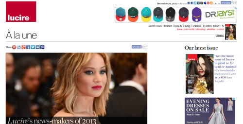
 Regular readers might notice, if they scroll, a few changes to our home page.
We’re not Facebook, so the change is designed to be evolutionary and not upset readers who have grown accustomed to where things are on the home page. There’s nothing tricky code-wise behind the scenes.
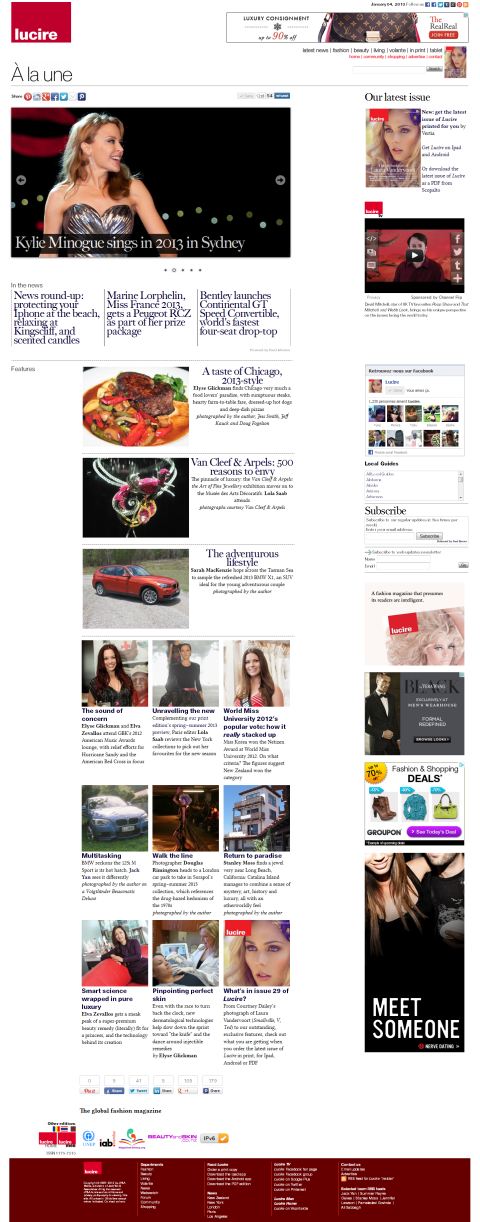
Recognizing the growing importance of this blog—after all, it forms the basis of our cellphone edition (and yes, we are hurrying up the guys who are meant to be ?xing the glitches)—a headline from here now appears there, below a Lucire TV video.
We will feature more from Lucire TV in weeks to come.
Feedback about the nip–tuck is welcome. We actually believe it’s quicker, despite the additional content, but we’d like to hear from you about that rather than presume we have a standard set-up (does such a thing exist?). (We found some errant code on the previous design, so those of you ?nding that the home page was quicker after Saturday were not imagining things.)
Our home page has not really changed much design-wise since 2006, and the inclusion of these posts is arguably the biggest change since then.
We may still rework the location of the blog post and the main story, as this blog changes far more regularly. Keep an eye on us—things will keep evolving.
You may also like