| The result was
the opposite to the principles that El Lissitzky
advocated: there were complex shapes, but in a relaxed
way |
|
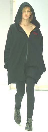 |
  
THIS PAGE: From the Nom D autumn–winter
2003 collection. ABOVE: Shown
again at the ID Dunedin
Fashion Show, this Nom D hooded top shows more clearly the screen-printed
patterns, in this case featuring a finger, a skeleton and the
Cyrillic words ‘Nom D krasny’. (Photograph courtesy
ID Dunedin Fashion.) |
|
  |
|
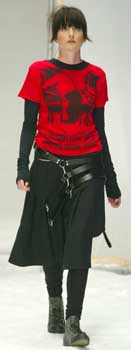
Upstairs in the Robertson house, a room had been
set aside for the stencilling of these logos and signs by their son, using an airgun. While they had roots in the Russian graphic
design movement of the 1920s and pioneers such as El Lissitzky, Robertson’s Cyrillic lettering was more about fun than the mechanical authority of that country’s propagandistic hand-lettering. Furry monsters, fingers and almost comical skeletons took their
place alongside the word krasny (Russian for red) in a graffiti style,
badges were generously placed to repeat the pattern, the overall
effect of which jarred, like the Volvo, with what might be termed
‘in vogue’ by the less initiated. Defying logic, Robertson’s
work was still in vogue—very much so this season as Nom D hooded
tops appear in stores—but following her own independent path.
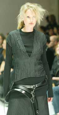
Other signs of her own path included the multiple
belts, executed differently this autumn-winter by not contributing
to deconstruction, but the overall structure of the garment. Structure
saw to a double-breasted jacket giving the effect of a cape; to
warm tops and sweatshirts; to fitted shirts with over-long sleeves.
The result was quite the opposite to the simple
graphic design principles that El Lissitzky advocated: here, there
were complex shapes accomplished by knits and construction, but
in a relaxed way. The irony of this is that Robertson’s inspiration
came not from Russia but a simple red square sewn on a gym frock.
Colours, however, probably came from elsewhere: red, black and powder
blue were part of this season’s palette.
Still androgynous, Robertson found another angle
to Nom D’s much-favoured style for autumn-winter 2003, on sale
at the time of writing.
Her husband had planned to sell the Volvo and
I was tempted. It was in Lucire red, but there was no way
I could write it off as a replacement for my Opel. I should have
taken him up on the offer: the cab I had called hadn't arrived—Dunedin’s
taxis were stretched during orientation week for Otago University
students. But then again, it deserved to stay in the Robertson family
a little longer, at least for the remainder of the season. It just
seemed fitting.
Jack Yan is founding publisher of Lucire.
|