


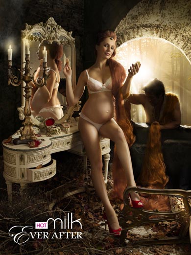
 Each time the Air New Zealand uniforms get redone, there are always comments from around the country, given that the airline is the national carrier. This time, the colour of the cabin crew dress might raise some eyebrows.
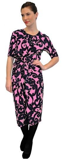
The ground crew options revealed tonight are smart and contemporary. The ‘twilight pink’ cabin crew dress is a stark departure from previous designs.
The designs are the creation of designer Trelise Cooper, whose work replaces the uniforms conceived by Zambesi.
Air New Zealand points out that the designs are not final and there will be additional consultation with its staff. Inflight concierges, pilots and other workgroups’ uniforms are still under development.
The uniforms are expected to début alongside a new fleet of Boeing 777-300 aircraft, though there is no announcement of whether the Air New Zealand brand will be shifting around that time.
The previous designs by Zambesi were considered to have pushed the envelope, and not universally embraced at first, before becoming accepted. Cooper’s work might follow a similar pattern.
You may also like


If that is a reflection of AIR NZ’s new cabins etc, I think I’ll be flying Qantas. ERK.
The female dress looks comfy to work in and that should count the most. But will that colour suit everyone?
The woman’s pantsuit would be OK for an office, but for comfort while working I’m not sure. It is definitely only made for a sliim, small busted body.
When were the Zambesi designs “accepted”? And if they are “accepted” – why are they being changed?
They are the worst possible design – design that draws attention to itself, the designer shrieking “look at me!”
Let’s hope Trelisse Cooper doesn’t go down that path, but the early signs are not good.
It is just awful……..truly awful. I hate the Pink Dress and the males uniform is a horror story.
God, even Jetstar have nicer uniforms.
A true fashion disaster.
I belong to the PINK STINKS group and am not surprised that Ms Cooper has chosen this colour. She is into very ‘girlie’ clothes which are not suitable for a commercial airline. The suite is O.K. but the dress from what can be seen is a very indistict,messy design and the fabric pattern and colours will tend to totally overtake the poor women wearing them.
Yuk yuk yuk
Dave, think about it: the initial furore died down, and no one bats an eyelid on the existing uniforms.
Change happens, otherwise things become stagnant. The question is whether the change is for the better or the worse.
@Jack Yan:
The public furore may have died down, but Air New Zealand had to make changes to the Zambesi uniform at who knows what cost.
There are reasons why Zambesi didn’t bid on this new contract.
Speak to almost any woman on the airline’s staff – especially those with a “fuller figure” – and they just roll their eyes and hope for the new uniform to come out. Or they did, until today.
The Trelisse Cooper female pantsuit looks fine on a stick thin model – but the real world isn’t about stick thin figures, it is about a working environment and that pantsuit is tight.
Sure, change happens, but I’ve no idea why Air NZ is obsessed with the “wow” factor and “bold statements,” instead of practical elegance and decent tailoring.
There are reasons why Christian Lacroix went bankrupt and this Cooper look is – at best – faux Lacroix.
I don’t run an international airline and I’m not a fashion designer, but I have had quiet a lot of experience with both.
I can see why you’d change the uniform when you bring in your multi-million dollar investment in new aircraft with – um, obviously – new interiors. Both are customer touchpoints that have an enormous influence on perception of the brand; and it’s the perception of the brand that allows them to charge a premium over discount fliers with no frills, creating profitability if done correctly.
Personality is the most important factor in cabin crew. That said, donning a garment you love creates confidence which is transferred to others via your personality.
But whether donning a slice of the Trelise personality is appropriate for the task is something I have serious doubts about. Frilly and fluffy, not in my mind very original and certainly not a reflect of any local culture -at least Zambesi’s could be loosely said to be “Pacific Rim” – maybe there’s something I don’t yet understand about her designs.
And that men’s outfit likes like a teddy boy or spiv – generates a lot of trust? I don’t think so!
Just because Trelise has success in Hollywood doesn’t make her a good designer, just successful. If Air NZ feel they have to go down that route (piggy-backing on the designers international profile) they could back someone who knows how to create intelligent, workable designs. I vote Kate Sylvester.
As an aside, I once caught an internal flight in Italy with Alitalia(?) their then national carrier, from Rome to Florence for a fashion fair. It’s possible the airline were aware of the kind of demographic they were carrying, because the two female cabin crew were beautifully dressed, rude, insouciant, obnoxious and captivating while they reeled about serving tiny espressos in their high heels!
Arriving back and picking up the AIr NZ flight in Fiji it was a pleasure to be welcome by our lads and ladies in their awful bluey-green poly-wool jackets and polyester navy blue ties. Here was someone whom you could put your trust in when the oxygen masks fall out or the engine catches fire!!
Perhaps there really is a happy medium, but it’s not something done by consensus. Or ditzy Trelise Cooper styles.
Phil: probably the best and most thought-out comment ever on this website.
Dave, we referred to the acceptance by the general public. I am unsure if there will be that same acceptance here, especially with the pink. I, too, heard of the complaints from Air New Zealand staff with the Zambesi design.
When designing for any corporate client, one must always go to the brand’s vision and mid-term strategy. Like you, I wonder about the rationale. What does this say about Air New Zealand?
Have air new zealand truly lost their mind? maybe their new branding is “bad taste theme” then it would explain it. My heart goes out to the poor staff.
once again Trelise Cooper is being portrayed as a wonderful designer with fresh ideas, but yet again she proves she is completely out of touch with everything. These are beyond hideous. Even for a pink-loving person! WTF would wear that men’s outfit! OR the one the man is wearing. The models don’t even appear to be happy wearing such disgusting items. The current uniforms are nice and don’t need to be changed. Just cos it’s a new decade, doesn’t mean good stuff from last decade should be ditched.
PS just because Trelise is a kiwi, doesn’t always make her right for the job. This mistake has been made often.
@Jack Yan
That seems to be two issues in one. By and large the NZ public accepts a remarkable amount of what they are given, because there isn’t much they can do about it.
I don’t think the public can be the arbiters of fashion, and I see an embrace by the chattering classes of what we might call the attention grabbing new, largely, I suspect, to draw attention to themselves, to promote themselves.
I think that is reflected in Air NZ’s decision on uniforms. They appear not to have learnt anything from the Zambesi debacle.
But is it endemic? Air NZ seems to favor the shock of the new, to be seen as “cutting edge” (the body paint tv commercials) whereas Pacific Blue seems to prefer the warm and fuzzies, at least as reflected in their tv commercials.
The other issue, Dave, is that initially shocking designs can become accepted, because we adapt or we see their merit. If we look at product designs such as, say, the Austin Mini Metro or the Ford Sierra, both looked startling on launch, and mainstream within a relatively short time. Some magazine redesigns go through a similar change.
I believe Zambesi’s designs fit into that realm, rather than any powerlessness on the part of the public. I am not saying every piece was wonderful, and I certainly was critical at the time. Over time Air New Zealand staff picked the items they were happy with, perhaps breaking some of the guidelines in the process, and we moved on.
What goes wrong is when the attention-grabbing overwhelms any substance or any awareness of the overall corporate vision, and there is a suggestion that this could have happened here.
It is, to adapt an old adage, the embrace of momentary fashion over a more elegant style.
Sadly, I do not think it is endemic: this sort of thinking is probably far more widespread among companies desperate for short-term attention, and manifests in different ways. Pacific Blue might well be thinking of the long term in comparison.
@jack Yan
It isn’t the issue for me. Bad design is bad design.
The public has come to accept The Beehive, mostly because there isn’t a thing they can do about it.
That new terminal at Wellington Airport fits – for my money – into the same category. What passenger in an aircraft wants to fly into a rock?
However – when you say:
“What goes wrong is when the attention-grabbing overwhelms any substance or any awareness of the overall corporate vision, and there is a suggestion that this could have happened here.”
I would agree completely, except that I think it is the corporate vision. As an Air NZ exec said: “We want to make a bold statement.”
So the worrying thing, for me, is that Ms. Cooper may well have fulfilled the brief.
You see, I’m not sure if the foundation behind the Zambesi designs was actually that bad, hence the eventual acceptance (notwithstanding the changes we’ve already discussed).
There is bad design that no one will ever accept, such as the 1999 Ford Falcon.
Regardless of how much time marches by, the EA169 model will probably always look ill-proportioned, and the car will be remembered as a dog.
The people who bought it were taxi drivers sold on Fords, diehards and those who didn’t much care how their car looked (this is a gross generalization). Everyone else wanting a big car bought a Holden Commodore.
And I’m not sure that the public accepts the Beehive, either. The public tolerates it, but it still looks pretty ghastly (especially) when one considers the alternative was mirroring the older side of Parliament Buildings.
I do, however, agree that the Wellington Airport design leaves something to be desired—and that it, like the Falcon, won’t exactly be remembered as a design classic in years to come.
One would hope that a corporate vision goes more deeply than making a bold statement, but I venture to say you are right. Giving such a brief is probably exactly what happened at one of the airline’s meetings.
@jack Yan:
I guess we mix with different groups of people. I don’t know anyone who actually likes the Zambesi uniforms.
I was at Whangarei airport the other day and asked a couple of people about them – I copped an earful.
But yes, certainly they are tolerated. What else can anyone do?
My one hope here is that Air NZ will react to the negative feedback I am seeing in many places, and at least get rid of the pink.
But sometimes, as I;m sure you know, corporate execs dig their heels in when their ideas are challenged. :-)
I reckon we must do, Dave—and if we all agreed, the world would be a boring place.
This discussion has been a great one—what a difference to some of the crap that passes for blog comments on a lot of websites.
You are right: oftentimes, bad design is just forced on us. And if we don’t speak out, then it’ll happen again and again.
True, too, about the corporate types digging their heels in, unfortunately.
Air New Zealand was careful to say in its release that the colours were not final. Maybe it knew the reactions would tend toward the negative?
That PINK colour would increase AIR SICKNESS and decrease Air NZ’s good reputation instantaneously!!!
Otherwise the designs and other colours are nice!
:D
“PINK SUCKS!”
:D
Trelise was selected from a group of designers including kate sylvester, but her pitch won overall. She’s still in the concept stage of her designs and is quite happy to recieve feedback to improve her ideas, these are not the final designs. Her target market for wealthier middle aged woman for her own label is obviously reflecting alot in her designs, and of course it is, she isn’t going to compromise her style and design aspirations, she was chosen as they believed she’d be the right woman for the job. I understand her brief is to create uniforms (when we hear the word uniform we don’t exactly jump out of our seats) But I believe she’s given it a fair crack. It may not be to everyones taste, but what is?? or even as ‘fashion foward’ as Zambesi tried to make their designs and got knocked back for, but it’s quite eligant, yes the pink defintly needs to be rethought but that was only one outfit the dress was also made in blue and green and it’s quite sweet with those fabrics- what do you want more black?? Her clothes have feminine silhouettes and are nicely tailored I really like the men’s outfit- it’s classic and won’t date as quickly as the Zambesi designs- they have a abit of life in them. I think it’s nice they are taking pride in Nz designers, and fashion culture, Nz seems to be so crittical of the many talents we have in Nz, she is a great business woman, and good as what she does- not everyone will like it, but how many of you actually would say something about her outfit if you saw a lady walking down the street in that dress>??
You will not find a single staff member who has eventually accepted the Zambesi uniform. It’s worn because it’s a uniform. What an awful thing for an Air New Zealand employee to have to face when that company has the capacity to be a global premium brand for the people of New Zealand and an example to the airline industry.
While the Zambesi craftsmanship is superb the image of that uniform does not represent Air New Zealand. There is no confidence, no radiance, no optimism, no impact, no punching above one’s weight and staring down the competition.
The basics of an airline brand are missing in the Fyfe administration’s decision making.
Ed Sims can whip out all the defensive spin he likes (“bold” and “contemporary”) now that the media have outed the latest mess (notice how Fyfe hasn’t fronted up).
I have no doubt that Trelise Cooper has delivered what was briefed because if you look closely at the garments they aren’t identifiably Trelise Cooper or Air New Zealand.
I wonder if Elizabeth Findlay had foreseen the damage Air New Zealand did to Zambesi’s image whether she would have continued with the project.
The question is this; now that the media spotlight is on this project, will Trelise Cooper risk her brand value to stay with a brand image so badly managed as Air New Zealand’s?
Will the New Zealand fashion industry allow itself to become an industry of brands that are questioned because one or two fashion houses partner with an airline whose brand management is questionable?
Bring back the brand management quality reflected by Barbara Lee.
This is not a fashion issue. The current Air New Zealand administration simply lacks branding basics and seems to lack accountability regardless of the cost to the brand, the bottom line, or staff morale.
Manufacturing pink flouncy outfits while desperately defending them as a ‘sunset inspiration’, or creating a male ensemble from what looks like old Hallensteins winter catalogues, is no way to build a global brand image. Would you wear those clothes in downtown Tokyo, London, San Francisco or Sydney? That’s where they will be judged.
Why not wow your staff and customers by getting back to basics. A uniform is just another media and it needs consistency across that media to deliver a consistent message.
The coming difficulty that will face Air New Zealand may be that potential commercial partners will not want to provide services to the airline. The quality of the airline’s decision making may pose a greater commercial risk to the brand of potential partners than any real commercial benefit.
Lee, this is an excellent comment. Not to make light of the content within, I am a huge Barbara Lee fan.
Oh yeah great piece Lee!
I avoided mentioning Barbara Lee, but there’s more experience designing uniforms AND designing for wealthy middle-class women there than perhaps has ever been shown by Trelise… Her Air NZ designs were probably the best ever, if stylish and professional was part of the brief….
And I see that Kate S was (apparently?) asked to submit but knocked back. By the Air New Zealand branding experts? Hmmm they must be looking for more flounce to present us internationally. Or something.
@MissDom, being a good businesswoman does not make you a great designer – ask some successful designers and if they are really honest, well they will tell you that you can be stunningly creative, contemporary and fashion forward, but that just won’t make you succeed on it’s own. It would not be fair for me to name some, but we can probably all come up with some names.
My opinion is that design – as opposed to art – is about problem solving. A designer is given a set of constraints and comes up with a way to solve the problem within those boundaries. If the problem is posed as a question, and the outcome is not the solution, we should try to make sure the right question was being asked in the first place.
Which leads us to the brief, and those who wrote it. I think that the marketing department at ANZ are either really clever for generating so much publicity by releasing these embarrassing pictures or just unable to make a good decision about some bad results, coming from an ill-conceived brief.
OK, Dressing up the cabin crew in clown suits will be great for the rugby sevens, but what if your core income is from business travel?
These are not design decisions, they are strategic marketing – something design has a relatively minor role to play in, but can cause considerable loss if handled incorrectly. Let’s hope this comes out alright, as we all own a bit of the National Airline.
So.. who has the best airline uniform? And would you pay more to fly with them because of it?
This is a fabulous departure, very modern and corporate. Why are people so negative when they first see it. It is a concept. It brings Air NZ into a modern, funky and iconic look that does reflect its status as a premier airline. Great going…and I look forward to see what the others look like.
I totaly agree with Philip k – Ppl are so negative when they first see it..It does bring airNZ into a modern, funky look! Good work AirNZ for choosing a unique top NZ designer to work with. Everyone seems to be slacking off the pink dress because its the most out there look of all, but have not sighted all the other amazing new outfits to choose from! The fabric maybe even more amazing in person..its just a picture! If the flight attendants dont feel comfy in the pink they can choose from other great outfits. Its a great new concept..I cant wait for the new look!
“If the Flight Attendants don’t feel comfy in pink they can choose from other great outfits”
NO THEY CAN’T because the whole range is vile. We hate it and we are sick of being patronised by people in the Hub who are totally disengaged from our customers, our community and our front line staff.
Middle managers can backtrack from this mess all they like by trying to reframe with words like “concept”, “choose”, or “it’s just a picture” but at the end of the day its an unattractive glut which offends universal rules of colour, cut, and shape.
Even the models look ill fitted and dressed down. She needs to fix her posture, and her flyaways, and get her pants taken up. He needs to get a haircut and shave. Sloppy and unpolished.
Across the terminals of the world these people will look like a gaggle of white trash. Instead, they should look like a beacon of smart, professional, trusted uber-Kiwis.
BASICS!
Thank god the media have covered this debacle so that staff can express their opinions on sites which are safe from KoruNet’s thought-policing.
They have a year to put the brakes on this pink and snot coloured triviality especially if its going to appear in the 777-300 cabins. That is millions of dollars wasted on a brand campain that will be unidentifiable and impossible to change in the long term because of the high aircraft furnishing cost.
This entire project stinks of the closed door ‘we know best’ pompousness that typifies Air New Zealand’s middle management culture. It is ruining our brand and workplace morale.
I wonder what self-satisfying bonu$ criteria will result in back scratching payouts for this one.
Make a choice – embrace best practice in everything you do or keep up the brand damaging nonsense that will cost our shareholders (the people of New Zealand) more millions.
Take a step outside the Hub (‘The Hubble’) and start engaging with the expertise in the world around you.
Stop trivialising our brand, stop patronising our staff and public, and GET BACK TO BASICS.
Wow! A dose of Pam hits the spot! I could only add that the brand actually would be identifiable, and that’s the big problem if it’s message is NOT smart, professional, trusted uber-Kiwis.
Still, the public is very strange and mostly unfathomable, unless you talk to market researchers and the like. Perhaps Air NZ could gather twenty top designers and critics and form a focus group?
I think trust is the most important thing for an airline to convey. Funky is – well great if your target market is under 20, or whatever funky means?
Other than that, a great design for airlines is for planes that stay in the air and don’t hit things – everything else is secondary ; )
Yikes!! Didn’t think it was possible to get a worse uniform than zambesi. I love my virgin uniform – classic and simple. The air nz staff will look like clowns
Pam, I like what you had to write there. No airline can afford to make any uniform changes—let alone one in which we, the public, have a stake—without staff consultation.
The first rule of branding—maybe not the first, but certainly one that you should know in your first hour—is that the internal audience must be won before anyone on the outside is even contacted.
If Air New Zealand has failed to do this, then its management is more clueless than I had ever imagined. It’s the first sign of a dysfunctional organization: one that fails to have any real internal communication. Oftentimes it is middle management that messes it up, and I think you’ve hit it on the head.
A big part of this is not so much whether these uniforms suck or not, but what do they tell us about the organization behind them? If you were kept in the dark, and if there is a thought-police in the organization, then that is very bad news, especially in the 21st century.
What choice, then, does Air New Zealand staff have but to voice its concerns publicly? (And I am very glad you did.)
Despite where this story has been published, what this is probably not about is fashion: there is a brand, a vision, a strategy, and a set of requirements.
How to do it right? Singapore Airlines seems to have a clue. A solid brand, and its uniforms reflect that evolution. While I sometimes love the Kiwi humour that the cabin crew engages in, I’d rather have the service levels that Singapore provides any day.
Bring back Barbara Lee
These photos are 7 years old but that uniform still looks fresh and smart – and is both identifiably New Zealand and Air New Zealand.
Bring back someone who understood fashion and brand management. Bring back Barbara Lee.
http://www.airnewzealand.co.nz/resources/tasman_takeoff_1.jpg
http://www.airnewzealand.co.nz/resources/tasman_takeoff_3.jpg
@Jack Yan: Many might agree with you about Singapore Airlines.
Looking for flights, I was surprised to discover that if you go the Air New Zealand website to try to book a ticket to India, it does not recognize any Indian destination. Delhi, Mumbai or Chennai, or their three letter codes, the booking engine will tell you – “no airports found.”
Now I believe Air NZ has agreements with airlines that do fly to India – and Singapore is one – but I know that if I were Indian I would simply go to another airline’s website.
This was confirmed to me by the Indian family at my local store, who prefer to fly Singapore when they go to India with Qantas as second choice.
When they fly trans-Tasman, of course they use Qantas so they can build by frequent flyer points.
I asked them about Air New Zealand and one of them laughed and said that Air NZ doesn’t even know where India is.
I’m not suggesting that Air NZ fly its own aircraft do India, but I do think they should make it somewhat easier for Indian Kiwis – a sizeable minority – to get to India.
And I think that has a greater priority than throwing yet more money at yet another trendy Auckland designer.
Dave: hear, hear! I have flown to India and the closest I can get with Air New Zealand is Hong Kong. From there it’s Cathay Pacific in to New Delhi (yet to try the Mumbai route).
You are so right, this is a massive omission—even respecting Indian New Zealanders enough to put three major cities in to the system would be something. And with India a growing force—we even sell Indian cars here, now (what we call the Suzuki Alto)—it is as important to service that country as China.
Awful. Cheap. Nasty.
It looks like I’ll be flying anyone but NZ cos those uniforms will hurt my eyes!
Why couldn’t you go with Charmaine love ever her dress that fergie wore was buch better. These designers are not reflecting Aotearoa. PINK..PINK what the???
rob fyfe likes pink and thinks he looks really hip and with-it. Is it any co-incidence that the worlds worst uniforms have been rolled out under his command? Good taste rob. Lol
Yes, Rob does seem to like lots of pink, and candy stripe, and lots of spun self promotion and adulation from no-name magazines. You’re either a ‘yes man’ or you’re ‘not supportive’.
Concierges (Flight Attendants who aren’t allowed to be called Flight Attendants in case they ask to be allowed to sleep) were the first victms of ‘Rob Wear’ fetish. One has to feel sorry for this poor dear putting on a brave face while someone asks if Rob let her have his shirt after breakfast:
http://albionlondon.typepad.com/log/images/2008/06/17/dsc00442.jpg
Midlife crisis taste, a matronly designer, and middle managers without a clue, sounds like the perfect team to come up with the worlds worst airline uniform:
http://www.dailymail.co.uk/travel/article-1242308/Air-New-Zealand-staff-say-new-cabin-crew-uniform-makes-look-like-drag-queens.html
Now, wear can I find an obscure rag mag to award Air NZ Uniform of the Year.