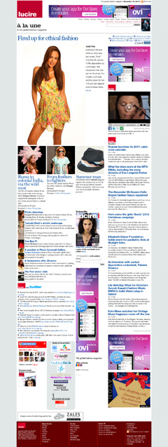
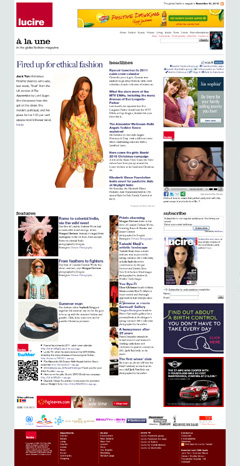
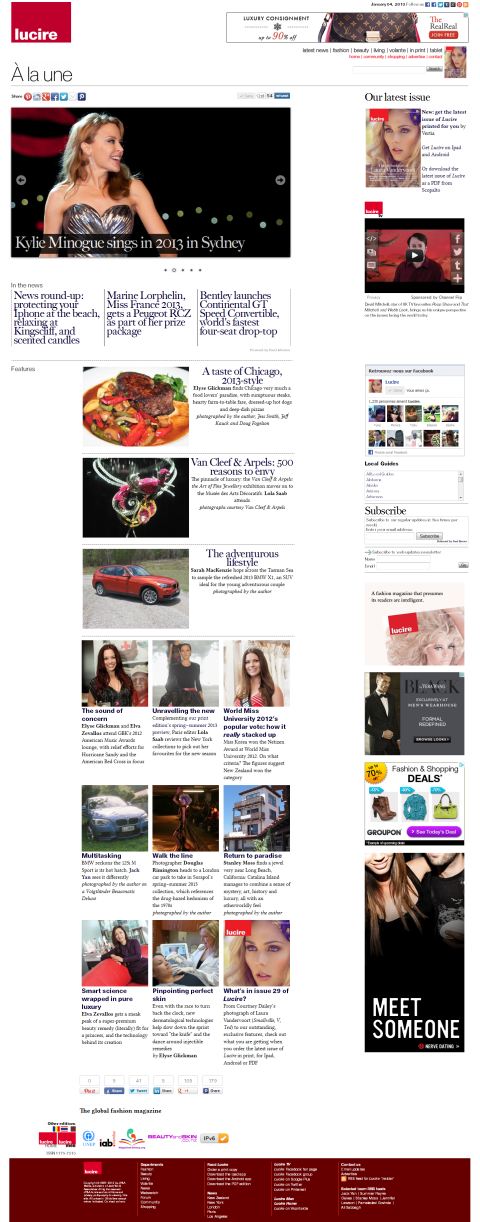
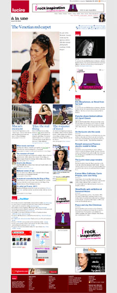
Visitors to our home page might have noticed a few nip–tucks as of this morning.
It’s an acknowledgement of how you use the home page.
The page is slightly wider, because many monitors are wider today. While it’s still not designed for those of you with 23-inch screens, it now has a nominal width of 1,054 pixels. That makes it a smidge wider than the 1,024-pixel-width screens we used to design for.
That allowed us to move the headlines from this section up top. It’s always bothered me with the former design that the headlines were down the page. In 2008–9, the biggest story of the day led the page, and we moved away from that toward a large image from one of our features for the past year. While that looked great in screen shots that we took—the large image was always quite imposing—it pushed the other stories down, and a lot of you didn’t want to scroll down.
You’ll notice from the above thumbnails that the new design is shorter—around 800 pixels shorter, in fact. That means a lot less scrolling.
Sadly, it does mean sacrificing a few things to make it work.
There were two fewer headlines and four fewer Tweets. We’ve also lost the tall, 160-by-600 ad: not great for us in terms of lost revenue, but hopefully if you’re more encouraged to click through, we’ll make a few bob back.
The lead image is smaller, restricted by height and not by width.
The Google Friend Connect gadget is gone, though we are reintroducing it on the ‘Community’ page, when that is redesigned. It was never really successful for us, probably because we never bothered to promote it, and it was stuck down the page in terms of real estate.
We have introduced a sign-up form for the daily updates, which used to reside exclusively in the ‘Insider’ section.
Coming up, we may rename ‘Insider’ to ‘News’, which is really what this is, while the current news page might be renamed ‘Webwatch’, a section name we used over a decade ago (and by no means original).
We also might introduce some of our blog headlines at the bottom of the page, but that’s still to be decided. Our priority was getting the news headlines up top, and I think we’ve managed to do that without losing the character of the earlier design. We also kept as many graphics as possible—call it design recycling.
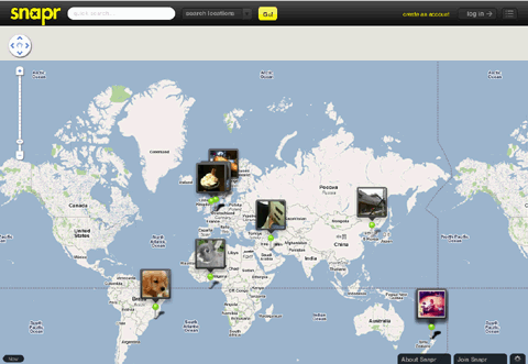
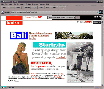
It’s a far cry from the very first layout.
Feedback is, of course, welcome. Hopefully the changes won’t meet with the furore of the Gap logo switch.—Jack Yan, Publisher

