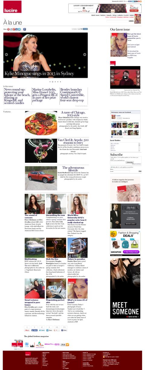
Top The new look for Lucire’s web edition home page. Deeper and cleaner than before. Since this screen shot was taken, we’ve made even more improvements.
Leading a redesign is always exciting, especially when there are more quiet news days at this time of the year.
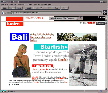
If you’ve surfed through our home page, or if you’re a Lucire Facebook fan who got word of it in one of our statuses last night, you’ll notice we are phasing in a new look. Only a few pages have it at the moment—we want to iron the bugs out and get feedback before it appears more widely—but we thought we had better get a few pages looking “more 2010s” and give you the sort of reading pleasure you had when you first visited the Lucire website in the late 1990s and early 2000s.
The changes are numerous, but here are the highlights:
- first of all, we’ve made it easier for you to share to your social networks, and made those sharing buttons bigger if you’re browsing on a smaller screen. We haven’t optimized the feature pages for mobile yet, but the new look will make its way to these news pages, which, as many of you know, are. We’ll go from there;
- bigger type. As screen resolutions improve, the sizes we had specified type at in the 1990s and 2000s seem rather small. So we’ve addressed that;
- bigger pictures. It’s a recognition of better bandwidth these days. However, we haven’t forgotten that a lot of the planet isn’t on broadband, so we’re glad to note that the basic HTML files for the new pages are actually smaller by 1 to 2 kbyte and we’ve optimized the images for downloading where we can;
- fewer ads. We know they can be annoying. With the new look, we’ve largely retired the 160 by 600 skyscraper size. We’re hoping that despite fewer ads, you’ll be encouraged to visit more, so what we make from advertising should balance out;
- comment forms. Finally! While you’ve always been able to send your feedback, and comment on news articles, we haven’t built in any forms for individual feature stories. That will change with 2013 stories going forward;
- and, on the home page, an animation! This is just us having fun. But we think you might like the top stories in a slideshow. It’s nothing new for a lot of our competitors, and we’re playing catch-up there. Now that we have caught up, we hope you like the first five we’ve chosen.
In addition to the home page, the ‘Volante’ index page has changed to the new look, as have two articles: Sarah MacKenzie’s 2013 BMW X1 first drive and Elyse Glickman’s 2013 Chicago dining guide.
There are other little changes, such as the disappearance of the callouts, or pull quotes, and much more noticeable ‘continued’ links for multi-page articles. The links to Digg have gone, too.
We’re still considering whether to remove the descriptions of each article from the home page, leaving only a byline, to make the look even more streamlined.
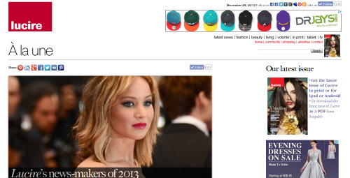
It’s a familiar feeling. At the end of 2002, a similar redesign helped usher in the New Year for Lucire, with the first article on designer Megan Tuffery and her residence at the time, Bruxelles. Until then, there were some lavishly designed stories, and ‘Megan Tuffery’s Brussels’ was created to partly standardize the Lucire look and bring in some more lessons from print. Looking at the page now won’t be entirely representative, since it links to a stylesheet that has since been edited. However, if you do, think of much lower resolutions and much narrower browsers—1,024 by 768 pixels was the norm—if you want to re-create the effect.
Interestingly, this latest redesign may be the first where web and cellphone viewing habits have driven the thinking more than old media.
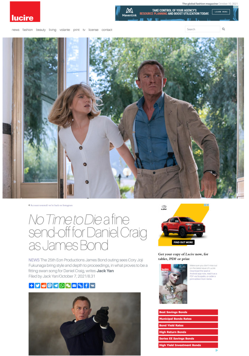
Back in 2002–3, that new look was also considered clean—but such is the nature of technology and changes that things get added, cluttering things up. We wonder how long the 2013 look will remain before it, too, needs a serious overhaul. Two years? Less?
For now, please enjoy our latest efforts—and look forward to these news pages eventually following suit!—Jack Yan, Publisher

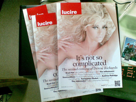

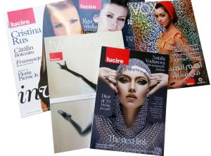
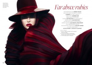
The new design looks great*. Having done some blog design I can imagine how much thought, effort and tweaking it must take. Pity even an elegant site doesn’t improve the looks of that BMW X1 you are currently featuring!
* FYI I’ve viewed on iPhone 3GS and Win 7 running IE10 beta
Thank you, Robin! Not the smartest looking SUV, is it? I prefer the X3.
Good to know it looks good on an Iphone and on Internet Explorer 10. I might have to give the latter a shot and see if it works. We have tried it on Firefox on XP, 7 and Ubuntu, two Android phones, and IE9 on 7. There are still some minor differences here and there, but overall, it looks fine.