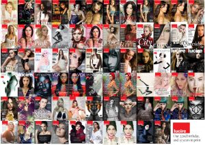
During the course of 2021, I came across a number of magazine covers from the late 1960s and early 1970s. The era has been the subject of a few pieces from me in the print editions of Lucire, especially the stylistic parallels, but one thing that has not followed suit, apart from some independent titles, are the simpler covers.
There’s still a habit to design with multiple cover lines, and it’s entirely understandable. If you don’t like one story, maybe there’s another that piques your interest. And who hasn’t been seduced by the promise of a good story based on a cover line, only to be disappointed by its relative brevity once you’ve bought the magazine?
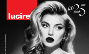
When we did the cover for issue 44, Lindsay Adler had shot such a stunning image, it was an easy decision to go with a simple typographical treatment and let the photo do the work. Why spoil it with multiple cover lines? By now, most people who purchase Lucire know they are getting good features, and that we don’t put any of the news items up front (and based on my memory, we’ve never done). Announce the theme (which we actually make up during production, and not a year before in a media kit), and give all the stories we wanted to mention roughly equal prominence.
We had decided to look at less text before Lindsay’s shoot arrived, and when the photos did, they sealed the deal. Around the time we finished the cover, someone I follow, Andrew at the Car Factoids on Twitter (as my personal account wasn’t taken down when Lucire’s was between October and December), posted a cover from Car from March 1970, which was similarly simple. The desire to see something like that in 2021 was “in the air”, and I felt it was time to buck the trend of ever more type-heavy fashion magazine covers.
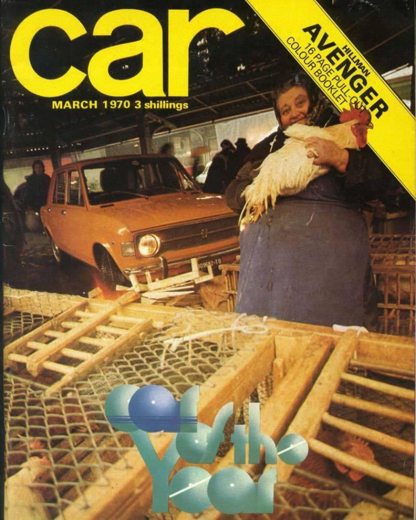
Above: Car magazine’s March 1970 cover, with little type.
Any observer of the history of fashion magazines will know that the 1950s saw covers with little type, too. As a teenager, I read up about Alexey Brodovitch and Mehemed Fehmy Agha, and admired their work, at the same time I was absorbing information about Jan Tschichold, Saul Bass, and others. It was obvious then that women were being missed in so many of the histories I read, and it transpires that two of the most influential, whose work I admired but never enquired into their art directing credits till well into my professional career, were women: Bea Feitler and Ruth Ansel.
Feitler and Ansel were behind Harper’s Bazaar’s art direction for most of the 1960s, Feitler landing the job aged 25. Feitler then left to be Ms. magazine’s first art director, worked with Rolling Stone to rework its format, and led the art direction of the revived Vanity Fair in 1982 before cancer took her.
I am in no way comparing my work to Feitler’s, but her influence on so many magazines has been understated in design history, and she deserves to be far better known and celebrated.—Jack Yan, Founder and Publisher
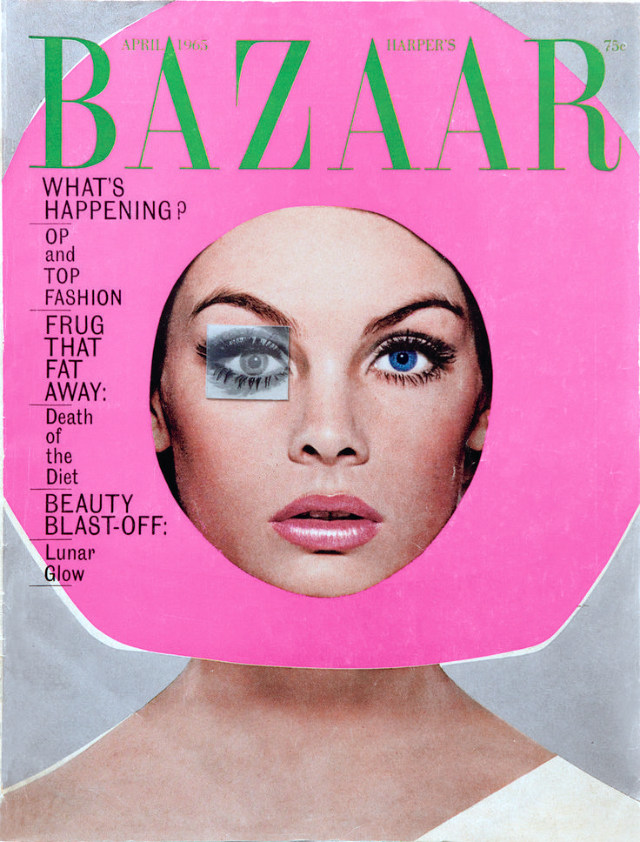
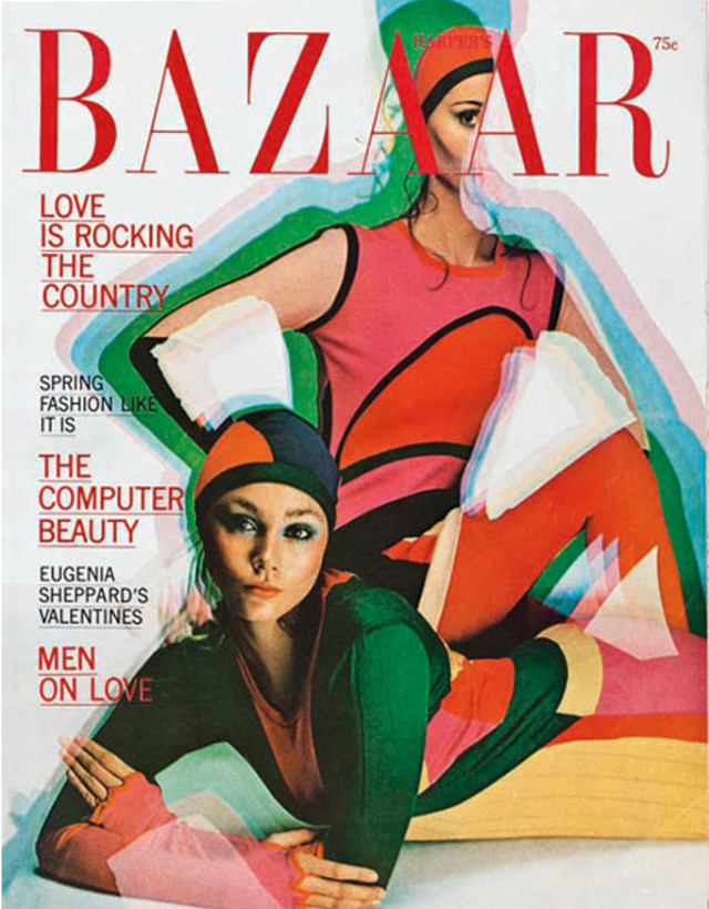
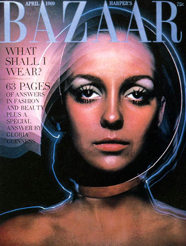
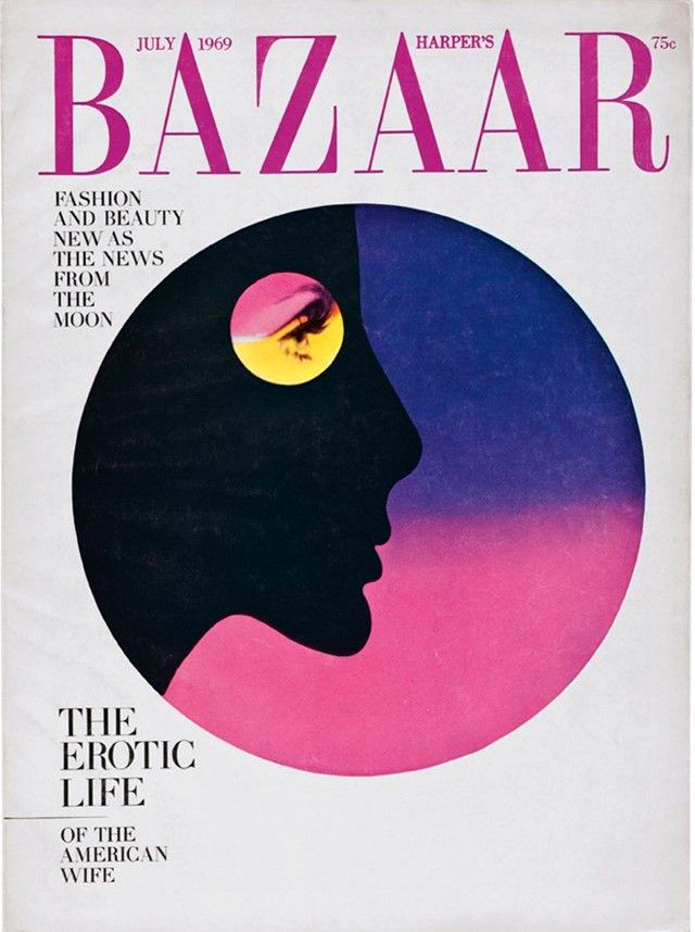
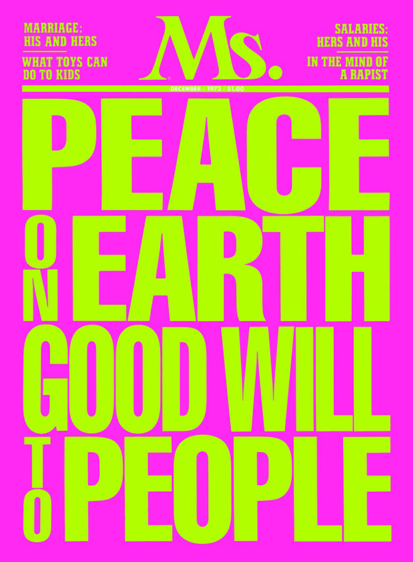
Above: Covers art-directed by Bea Feitler and Ruth Ansel at Harper’s Bazaar, and by Feitler alone at Ms.

