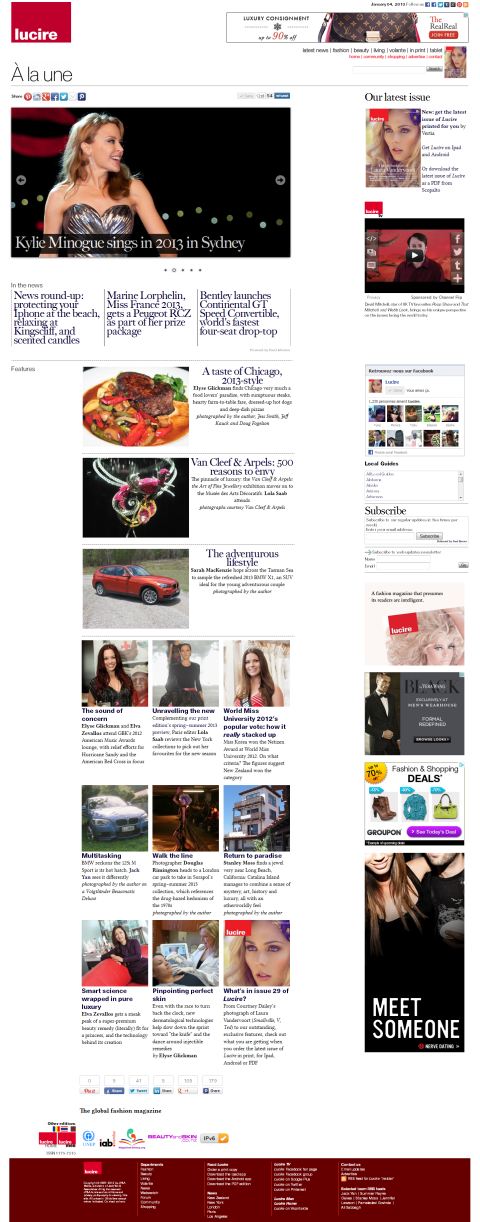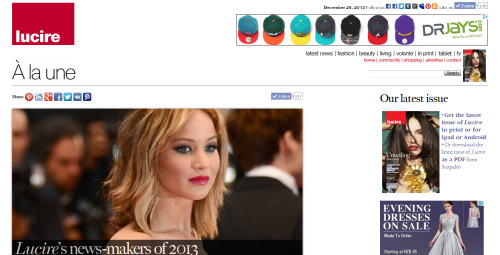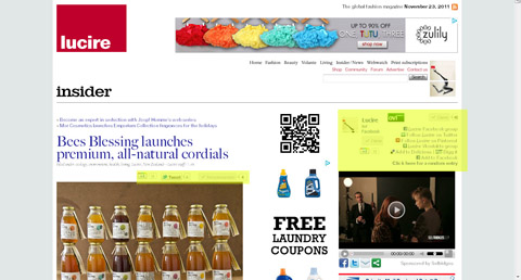
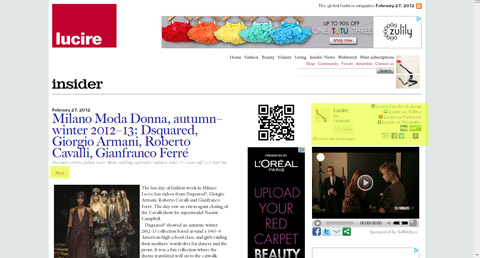
Top The old news page layout, with two sets of buttons. Above Slimmed down as of today, hopefully making things easier to understand.
We’ve had a very minor nip-tuck to our news pages, and if readers have few issues with it, we’ll be rolling out these changes to the rest of the site gradually.
We realize that all the buttons for social networking were very confusing on the news pages. The feature pages tended to be a bit easier to understand, but since this template came into service a few years ago, there were links to Digg, Facebook and Delicious on the far right of the page for the section, and buttons for individual stories below the headline. It got messier, too, as each new service was introduced: Google Plus, the Nokia Ovi Suite, and Pinterest, and we programmed in separate links for each one.
Today, we’ve cut back. Po.st has supplied a more sensible set of buttons for us to use, all grouped on the far right of the page. If you’re on the main news page, the buttons will apply to the entire section. But if you’re in a news article page, the buttons will apply only to that page.
We’ve also tidied up. We’ve retired the Delicious link as that service is no longer one of the main ones that people use to share. The Topsy Twitter links have also been retired, since the code did not function as expected on a lot of our pages.
The only button left in the main story is a Pinterest one, but we’ve shifted it to the top of each story, below the headline.
The Twitter and Facebook count is now located at the bottom of each post, along with additional sharing buttons for other services.
Your feedback is, as always, welcome.

