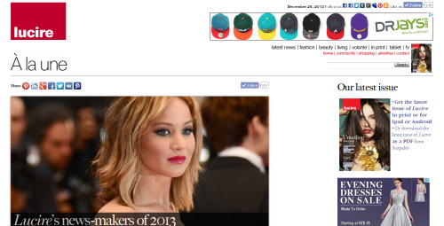
We’re currently experimenting with a new look at Lucire, our first facelift in three years.
In the world of the Web, three years without a change is a long time. And if you like what we’ve done, we’ll roll it out more widely across the site.
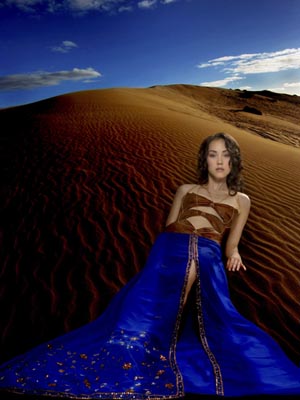
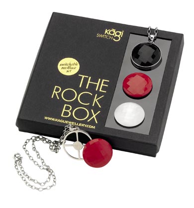
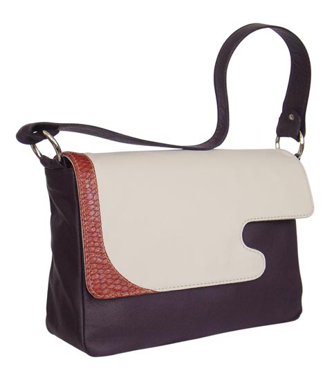
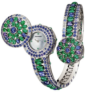
Hop on over to the first article with this look, where we have a look at designs by Bethany Halbreich of the US, Karishma Shahani of India and Anna Killick of New Zealand. These are all beautiful travel-inspired designs in dresses, bags and jewellery.
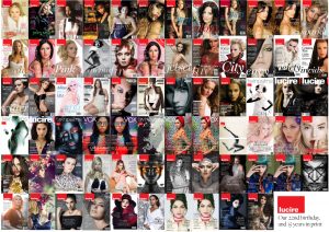
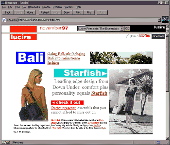
The inspiration for the new web design was internal. In December 2002, we facelifted Lucire’s website and débuted the look with a story on Megan Tuffery and Bruxelles. (Note that the way this page looks today differs from how it looked in 2002, due to the change in stylesheets.) The Lucire layout has evolved since then, and the big development mid-decade was the introduction of larger ad sizes, to cope with the growing resolution of computer monitors.
In 2006, we wondered how to modify the site to take advantage of these ads, notably the 300- by 250-pixel unit that you see to the right of this page.
At the time, the web design trend was soft corners, a slight three-dimensional effect, and off-white shades. The pages were relatively complex, but we persisted.
However, in 2009, the style is somewhat different—simplicity has returned to some websites, and we wanted to bring the look in line with what we were doing in the print editions of Lucire.
Head designer for the print editions, Tanya Sooksombatisatian, drew up thumbnails in February 2009 in anticipation of the new style. Her observation was that websites were getting wider—and indeed, the Lucire web look had become ill-balanced on some screens, such as the ultra-wide Mac monitor of fashion editor Samantha Hannah.
The latest design is planned for a nominal width of 960 pixels (the previous was 780), which does mean some people will need to widen their browsers. Based on our research, however, this should suit the majority of users. There’s even more good news in that it should be quicker to load for most people.
But the overall look was directly inspired by the wide, spacious feel of the 2002 design—which unexpectedly accommodated wider images than what readers have had to put up with over the last three years.
The look is not final. Unlike some websites, we believe readers are allowed to have input. They are most welcome in the comments.
Browsing at Hunters & Collectors
Lucire’s A to Z week: from Alexandra Owen to Zum Wohl
Lucire experiments with a new look online
Categories
branding / design / fashion / history / Lucire / New Zealand / publishing / technology / tendances / trend
Filed by Lucire staff
branding / design / fashion / history / Lucire / New Zealand / publishing / technology / tendances / trend
Filed by Lucire staff

