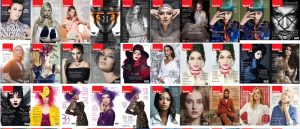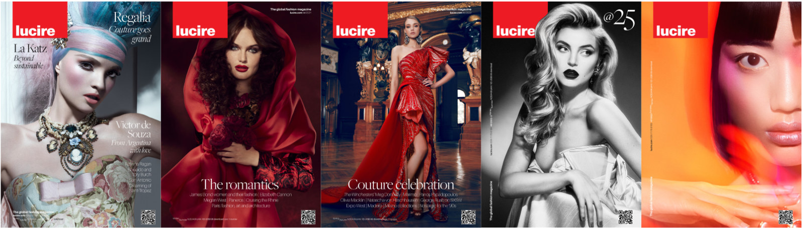
Going on the incredibly unreliable metric of Instagram likes, our latest cover has been more popular than our 25th anniversary one. We’ve covered a little bit about how we came to doing our first cover (at least of the home edition) without any cover lines. As Lucire evolved over the last few issues, we were blessed to have some stunning covers. Lindsay Adler’s issue 44 cover (‘The romantics’) certainly qualified in the ‘It’s so stunning it would be a shame to ruin it with type’ category; not that others didn’t, but I don’t think we were quite there before. Prevailing trends and market-place demands kept the cover lines going, as they do with Lucire KSA. But something came together with issue 44, and we went minimalist: a single headline announcing the theme, with the stories in light type below.
I thought back to some old favourites, such as issue 37’s ‘The next link’, photographed by Kourosh Sotoodeh, where the image was dominant; and I was already being influenced by some covers at the dawn of the 1970s, where some magazines were similarly image-led on their covers. As I noted when issue 44 came out, the lack of cover lines was common in the 1950s, although I feel we’re harking back to the 1970s in tone.
Things weren’t quite as impactful for issue 45, the cover of which Greg Alexander photographed, but the background was so ornamented it would have been wrong to put type over it. The cover could have taken a very different turn but we decided an evolutionary approach was better.
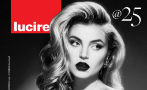
For our 25th anniversary, we had an excuse to have the single cover line of ‘@25’, in the corner of a photograph shot by Lindsay Adler. I wrote about this cover at the time. When placed in a row, you can see how our thinking evolved.
And now we’ve gone cover line-free for the first time here, though Twinpalms Lucire tended to do without type on their covers, except for the masthead and our logo. When I look back, we’ve followed some of the ideas of Miguel Kirjon, who ran Twinpalms Lucire, such as being far more feature-based.
It would have been easy to plaster type down the left of Taras Taraporvala’s photo but it would have ruined it. It’s not due to bad stories, either: you can see what they are for yourself. It just felt right, based on where trends are, and that Lucire readers are a faithful lot who absorb the entire magazine and not just a story or two. We’re not a mass-market weekly and I have long said magazines like ours are effectively soft-cover coffee-table books.
Cover lines may or may not return next issue: it’s too early to tell. But for now it’s nice to enjoy this evolution and this moment in magazine design trends. It’s impossible to create something that’s truly timeless. Everything is of its time, and the last five home covers are very much of their respective periods.
Jack Yan is founder and publisher of Lucire.
You may also like